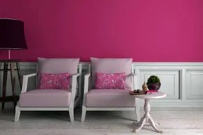
For more than 30 years, visiting football teams at the University of Iowa at Kinnick Stadium have faced an all-pink locker room. Not only the walls are pink. The urinals, cabinets and floors are also the same color. Former coach Hayden Frye started this tradition. He studied psychology. He believed that the color calmed his enemies.
The team tried to fight back. Some people cover their walls with different colored wallpapers. Losing players blame the color for their loss. But are they really right? Or is this just an excuse? I can’t say for sure. We know that the color of a room can affect your mood. Police use pink paint to calm drunk prisoners. Some prisons require a pink paint. A Missouri prison decorated its pink walls with blue teddy bears to comfort the inmates.
It’s not just pink. Interior designers know that colors affect our mood. Gender, culture, age and personality all play a role. However, color has a bigger impact than we think. Red and blue are associated with improved memory and creativity. What colors help keep your home tidy?
Warm and attractive colors
Some colors are nicer. Would you like to have surgery in a bright red room? Probably not. Most of us spend our time in a relaxed and peaceful atmosphere. Let’s see which colors make the space feel like home.
Yellow is probably the cheerful. It represents spring, prosperity, sun and happiness. A yellow room promotes optimism and enthusiasm. This color can be used in almost any room. But be careful. Tone is important. The soft yellow color suits a bedroom well. Not so with flashy gold. I don’t want to think about bumblebees every time I walk into my house. Choose a lighter one.
White represents peace and purity. In today’s society, that means hygiene. White rooms are cozy but sterile. Pay attention to the furniture. As long as it has pretty decorations, it’s fine. If food drips on your shirt, you’re in trouble. White says it all. White walls look more messy. You may need to clean it more often. On the plus side, messy husbands and kids quickly put their toys away.
Blue reflects the sea and the sky. It symbolizes harmony and reliability. Blue space stimulates creativity. This color has a calming effect and lowers your heart rate. It works in any room. Bedrooms, bathrooms, or offices. Calm blue has a relaxing effect.
Green brings nature indoors. It suggests revival and freshness. Green means health. Some colors may make you feel uncomfortable. It is suitable for the kitchen or bathroom. Both the bedroom and the living room are very suitable. Keep it clean. Think treetops. It’s not a cold color.
TLC tip: All colors have a range. Bright colors are more impressive than pastel colors.
Bright and exciting colors
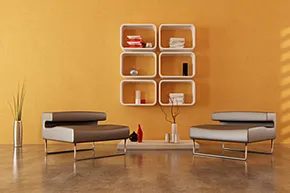
Babies can wear light blue clothes to sleep. A nursery growing in soft pink. But if you try to throw a dinner party in a light blue box, the atmosphere will feel boring. It takes energy. You want to use bold paint colors in your event space to spark conversation and maintain the energy of the room.
We show you how to choose shades that really help when you don’t want anyone to fall asleep.
Red: heart rate booster
Red does not ask for permission. Be careful. It’s the color of stop signs, fire trucks and…yes, blood. Your brain is wired to stop and look.
Mentally it was a rollercoaster. It foreshadows danger and love at the same time. Physically, your heart rate may increase. That’s why it’s perfect for your living room or a converted basement party where you need some motivation.
Red improves the productivity and memory of focused workers.
However, not everyone can use it for free. If your team (or your roommates) get distracted easily, wearing red will only confuse them. Use it when your goal is high energy, not when quiet focus is needed.
Orange: gentle energy
Orange is pumpkin spice and autumn leaves. Although it’s bright, it doesn’t have the aggressiveness of red. It’s the color of Halloween, and it’s fun, but also ephemeral.
This makes it the perfect choice for spaces that are cozy but not overwhelming. The kitchen benefits from this heat. The same applies to toilets and playgrounds.
But the problem is that orange polarizes. It’s a mix of yellow and red, but some people don’t like that combination. Don’t paint your whole house orange and expect applause from all over the world. Choose a room with a relaxing atmosphere and low risk.
Purple: Royal or Ducky?
Think of purple as blue’s louder cousin. It has a historical connection with the royal family and is full of wisdom, quality and spirituality. It can be arrogant. It has a calming effect. It all depends on the tone.
Use it to make a statement. bedroom. laundry room. in the hallway. Just watch out for saturation.
Deep and soft plums have a luxurious feel. Neon purple? It feels very sticky. There’s a fine line between exotic and cheap, and most people cross it. If you want a vivid accent color for a modern home, choose dark, rich colors. Avoid bright colors unless you are painting a nursery.
Black: Space Eater
Black is a lack of light. By painting the room black, it will feel smaller. Even if you are claustrophobic. This is authoritative. Very demanding.
Unless you’re the kind of boss who fires employees for fun, don’t paint all four walls black. Reduce the visual footprint of your space.
Use it as an anchor point. Create a dramatic backdrop for up to one or two pieces of wall art. Bright colors stand out.
- red
-yellow
-white
These shades stand out against the black background. Combining black with other dark shades will only create dark holes in your floor plan.
The most important thing is not only the choice of color. Choose the right intensity for the right activity. Don’t just follow trends. See how you use the room. If they fall asleep, be gentle. If you are still alive, be brave.